We will focus on Visual merchandising Tips and Techniques in this article. Visual merchandising is the art of retailing for fashion and apparel brands. This is commonly shown in retail stores and trade shows. In the present apparel and fashion retailing business, visual merchandising is the most essential techniques to display the shoppers inside the store for increasing the sales of products.
Visual merchandising tips and techniques
You don’t need to spend a lot of money to create product displays that beautifully showcase your products and convert more people in research mode into paying customers. Just follow these 10 visual merchandising tips and techniques:
- Understand your target customer’s psychographics
- Get inspired
- Appeal to the five senses
- Use design theory to build your displays
- Be bold
- Playoff your store’s theme
- Guide customers through your store
- Add interesting signage
- Group products that are commonly bought together
- Routinely refresh your product displays
1. Understand your target customer’s psychographics
Understanding your target customer is the first step to creating effective visual merchandising and product displays. By that, we don’t just mean understanding demographic data like their age, income, and education; dig deeper into their psychographic information and get to know what drives their decisions and what type of lifestyle they live.
A good way to start is by combing through the customer data on your point of sale system (especially a customer’s order history!)
2. Get inspired
With the internet, sources of merchandising inspiration are nearly endless. Before you start building your displays, try skimming these resources for storefronts that have created eye-catching product displays of their own:
- Design Retail Online
- Smart Retailer
3. Appeal to the 5 senses
While it’s tempting to focus on your product display’s visual look, don’t neglect the other four senses.
The secret to a truly experiential retail store is to create a multi-sensory experience (also known as sensory branding). Here are a few ways you can create product displays that engage with each of the five senses:
Sound
The music you play in your retail store can have a big (but subtle) effect on how customers behave. Depending on your target customer, you can play mellow, soft music to encourage them to take their time and browse. When curating your store’s playlist, think of your target customer and what they listen to: you want the music to be appealing to them, first and foremost.
Touch
Remember to give your customers the ability to touch, feel and test out whatever you’re selling.
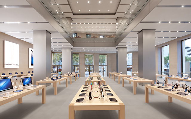
Perhaps the most widely-known example of a retailer that leverages touch is Apple. Each of their products are featured on an open display and ready to be used by customers. This helps customers foster a sense of ownership over the product they’re using and increases the probability that they’ll buy it.
Smell
Do you know about scent marketing? Global megabrands like Sony, Verizon and Samsung have used it to their advantage with great results.
Scents are quickly transmitted to the amygdala, the part of the brain that controls both emotions and memory. If someone smells something they like, it’s automatically registered as a positive memory that made them feel good. Scent can be a deciding factor for attracting more long-term customers.
Taste
If your business sells consumables, giving customers the ability to sample products before they buy is similar to letting customers try on clothes. It’s a best practice.
In his book Influence: The Psychology of Persuasion, Robert B. Cialdini, Ph.D., showcases research that demonstrates the power of giving something away for free. Whether they realize it or not, those on the receiving end feel a need to reciprocate, usually by buying the product.
Sight
From using colors for their psychological triggers to using lighting, balance, symmetry, and contrast, merchandisers need to control where and what a customer looks at in-store.
4. Use design theory to build your displays
Your displays are a critical part of your overall design and can easily make or break the flow of your store. Understanding some key design theory will help you build displays that are eye-catching and go with your in-store design.
When building your displays, keep these four design theories in mind:
Balance
Achieving balance within your in-store displays is key in guiding your customers around your store and providing a cohesive experience. Balance in your store can be either symmetrical or asymmetrical.
Symmetrical balance uses design elements that have the same weight, while asymmetrical uses items of different weights. While symmetrical displays can add consistency and order to your store, sometimes using asymmetrical designs can help add a more interesting touch to your display, adding more of a focal point to certain elements in your design.
Contrast
Providing contrast will help you bring emphasis to items or displays within your store. Ultimately you don’t want your customers to get lost in a sea of products. Having a focal point within your displays will help guide your customers’ eyes to certain products or sections.
Choosing certain color schemes can help provide contrast to your displays. Using black and white, monochromatic colors or other contrasting colors can also add a pop to your displays.
White space
Not every corner or space in your store needs to be filled with displays or products. White space, or negative space, is an important component of your store design.
White space can ultimately help highlight certain displays or products, adding a focal point within your display and reducing clutter. When used correctly, white space gives your product’s room to breathe.

Retail giants like Apple have mastered the art of creating in-store experiences, so much so that their stores are instantly recognizable around the world.
Apple is also well known for their use of white space. Their minimalist and modern in-store displays are beautifully simple, with the purpose of keeping the products on the center stage, allowing customers to use and feel them as they go along without creating clutter.
Unity
Ultimately, the overarching element you need in any store is cohesion. Creating unity amongst all your in-store displays, decoration, and design will make your store come together visually for your clients, and help you stay on brand. Make sure all the design elements you are using when putting together your store make sense with your overall brand. You might find great props or accessories, but the most important thing to keep in mind is whether or not they fit with your
Visual merchandising Tips and Techniques
5. Be bold
The goal is to create product displays that get customers to react: by snapping a photo and sharing it on Instagram, interacting with the products, and eventually buying them. To do that, consider being bold with your visual merchandising.
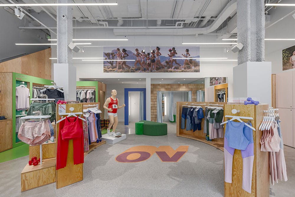
Just look at how athleisure apparel brand Outdoor Voices went bold with their New England store. Bold, contrasting colors and even a marathon running mannequin.

6. Playoff your store’s theme
When it comes to designing your window display, it’s important to remember that your window is only one part of your overall store design; make sure it matches your store’s overall decor, style, and branding.
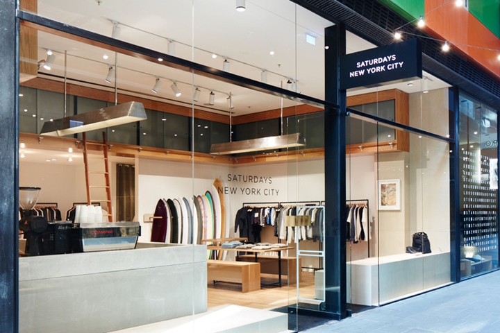
Take, for example, New York-based retailer and cafe Saturdays NYC. Their name says it all: they sell apparel that’s inspired by surf culture (and surfboards). Their store in Melbourne, Australia puts what makes them unique on full display.

7. Guide customers through your store
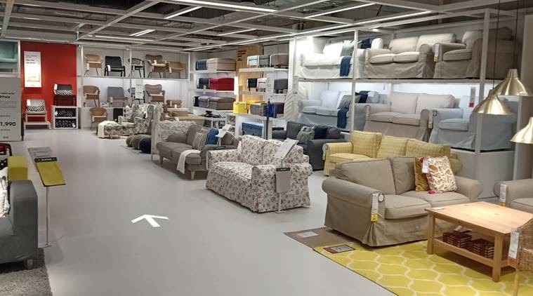
IKEA has become a worldwide example of how to guide customers through their stores. Their maze-like concept groups products by living space and takes buyers through a home shopping journey.

Have you ever gone to IKEA and left the store with more products than planned? Their path-like concept means you can’t really see what’s coming next, instilling a need to stay on course, picking up more items along the way. This ultimately generates a sense of ownership over the products, decreasing the chances that you’ll put them down before you get to the cash.
While you might not have the same space or concept as IKEA, the same rules apply. Grouping products that share a similar theme make your store easier to navigate and allows customers to browse by category and find additional add-on purchases along the way.
8. Add interesting signage
Creative signage can help you clearly group and departmentalize your products, tell customers how they’re made, display promotions, and more.
Just look at how Allbirds uses in-store signage to clearly show customers which category their shoes belong to. This helps customers find what they’re looking for quickly and compare products (plus, they look really cool.)
9. Group products that are commonly bought together
One way to improve your in-store experience is to use your displays to cross-sell certain products. By using a point of sale with reporting capabilities, you can easily find data about what products to cross-sell and how to arrange your displays.
With Lightspeed Analytics’ Commonly Bought Together report, you can search different combinations of products that customers have purchased in the past, allowing you to craft the perfect display set up and also create your point of sale marketing strategy.
Cross-merchandising is a great way to increase your customers’ average basket size. By conveniently placing products that go well together, you make their shopping journey much easier, and also give them ideas they might not have thought of before.
If you own an apparel shop, make sure you keep outfit elements that are displayed on mannequins within close range to make the shopping journey as easy as possible for the customer. You can also use signage to give customer’s ideas of what to buy, or what accessories might go well with the product they are looking at.
10. Routinely refresh your product displays
Your store’s design isn’t meant to stay the same. Every time you have a new, noteworthy inventory or transition from one season to another, you should consider refreshing your store’s merchandising, displays, layout, and signage.
Bob Phibbs, one of the world’s leading experts in brick-and-mortar retail, suggests that merchants update their product displays on a monthly basis.
Times change and so do your customers. Keeping your store relevant goes hand-in-hand with your design and how and when you update it. When creating your store design, make sure you opt for something you can adapt with time.
At the end of the day, your store’s look will depend entirely on your products and your brand and how you want to connect with customers. Take the time to understand your brand and translate that into your in-store design. Ultimately, you need to create the design that’s right for you.
Visual merchandising Tips and Techniques
Don’t Miss 20 Visual Merchandising Techniques
- Find out some innovative and creative display inspiration to attract consumers.
- Winter, spring, summer, and fall is the common visual merchandising theme but try to apply different theme in every one month. Follow different special events like Father’s Day, Mother’s Day, Teacher’s Day, Valentine’s Day, anniversaries festivals, and other celebrations and holidays to create a different visual display.
- You can try to use the same window display theme every year but avoid using the same materials, boring ideas, display, and style.
- To decorate visual display, correctly apply the elements of art and principles of design.
- Used advanced technology to display product advertisements, messages, special events, offers, etc on multimedia or flat-screen televisions.
- The customer always uses their 5 senses like sight, sound, touch, smell, and taste to select their desired products.
- Show your imagination on display set-up and decorate mannequin with latest releases fashionable clothing and stylish fashion accessories but not tell.
- The same color, price, size, or types of merchandise are kept together. For this reason, they buy more items in a short time.
- To get strong results, use the prefect color and props to catch the customer’s attention.
- In arranging product displays, some visual merchandisers are tried to set the rule of three. Like asymmetrical, symmetrical or balanced, Pyramid Principle, side by side or short, medium, and tall style.
- To get customers direct attention, use spotlights for highlighting exclusive products.
- Product display areas are started closest to the front door.
- Leave your old display immediately.
- Move or rotate your product displays after two weeks when came new products in-store.
- Use enough signs and graphics in your store to get the customers’ attention.
- Prepare an ideal floor plan in your store like keep more spaces, keep your shelves height lower than 10 feet, well-decorated racks, and avoid more products.
- Keep your retail store clean and fresh.
- Ensure that all of your stock products are is priced.
- Focus your price point on merchandise.
- Use little flavor fragrance, slow music, and dramatic lighting inside your retail store.
